Each year, the two national teacher unions, the American Federation of Teachers (AFT) and the National Education Association (NEA), release their surveys of public school teacher salaries across the nation. And each year, they take advantage of this opportunity to bemoan the condition of teacher pay. On the April 2002 release of the NEA’s data, then-NEA president Bob Chase complained, “It’s hard to convince someone to stay in the classroom when the salary is so low.” Likewise, the AFT decried the fact that the “average teacher salary continues to fall well below the average wages of other white-collar occupations.” The average teacher, according to the AFT, earned $43,250 during the 2000-01 school year, compared with an average of $52,664 for mid-level accountants; $71,155 for computer system analysts; $74,920 for engineers; and $82,712 for attorneys.
Of course, the AFT has chosen the comparison groups to make its best case. Where, one wonders, are the comparisons with journalists, registered nurses, assistant district attorneys, FBI agents, military officers, and other not-so-highly compensated professionals and public-sector employees? Shouldn’t the average pay of a high-school English teacher be compared with that of writers and editors? One could make a case that the salaries of high-school physics or calculus teachers should bear some resemblance to those of computer system analysts, but does the AFT believe that the appropriate compensation benchmarks for 3rd-grade teachers are the salaries of engineers or attorneys?
Nevertheless, data from the NEA and AFT are highly influential. Indeed, the U.S. Department of Education collects few data of its own on this matter. For the most part it simply recycles these union data in publications like the Digest of Education Statistics 2001, a standard reference in which five of the six tables on teacher pay are based on union figures. On the whole, such data present a fairly accurate picture of teacher salaries at the national level and have some value for state-to-state comparisons. Yet they suffer from severe limitations when interest groups, policymakers, and pundits use them to make a point about how the nation values public school teachers.
Summers Off
One facet of teaching that the NEA and AFT, in their data and in their public pronouncements, routinely fail to account for is the shorter workday and work year. In public schools, the median number of school days is 180 per year. Add half-a-dozen or so workdays for parent conferences, professional development, and planning, and the annual work year for most teachers is still shorter than 190 days. By comparison, an accountant or lawyer with two weeks of paid vacation and ten holidays or personal days will work 240 days annually—nearly 30 percent more days per year than public school teachers.
The typical teacher also has a shorter on-site workday than most other professionals. On average, teachers report being in school for fewer than 38 hours per week. This number rises to 40 hours if largely voluntary after-school activities such as coaching or club sponsorship are included. In fact, language limiting the number of hours that teachers are required to be in school is common in their collective-bargaining agreements, particularly in urban school districts. In the just-expired New York City teachers’ contract, the contractual workday was just 6 hours and 20 minutes (including a 50-minute duty-free lunch). The new contract extends the workday by 20 minutes. In Chicago, the limit is 6 hours and 45 minutes, including a 45-minute duty-free lunch.
Of course, many teachers put in nights and weekends at home grading papers and planning for the next week. However, a job that permits relatively more work at home is typically more attractive (particularly to women with children) than one that requires a similar amount of work time on site. And many other professionals bring their work home as well.
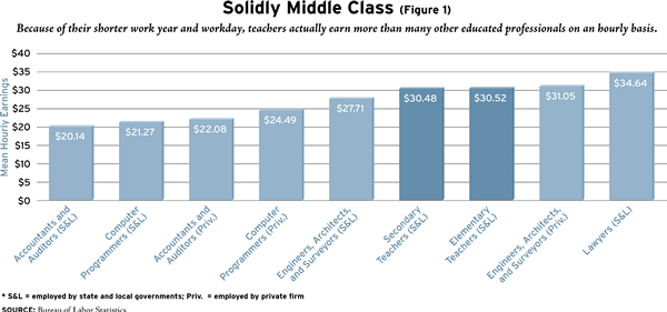
The combination of a shorter workday and work year means that the annual hours on the job for teachers are much shorter than in comparable professions. Consider Figure 1, which shows hourly rates of pay computed by the Bureau of Labor Statistics for a variety of occupations. By these calculations, only engineers, architects, and surveyors in private practice and attorneys earn more than teachers on an hourly basis.
The shorter workdays and work year make teaching an attractive occupation to those who wish to balance work and family needs. The shorter hours are especially helpful to women who want both a rewarding career and children, which helps to explain why roughly 75 percent of teachers are women and the share is increasing. An additional plum is that the on-site teaching hours match the schedule of a teacher’s own school-age children. In short, when the kids are at home, so is mom (or dad).
Consider the “sick kid” challenge. In many professions it is very difficult to take unscheduled time off for a sick child or other family emergencies. In teaching, however, the “substitute teacher” solution is a routine part of school life. Indeed, in collective-bargaining negotiations, school administrators frequently complain of excessive absences among teachers. According to a recent U.S. Department of Education survey, during the 1999-2000 school year, 5.2 percent of teachers were absent on any given day on average. That translates into 9.4 days out of a 180-day school year. During the 2000-01 school year in New York City, the annual rate of absences reached 11.3 days per teacher. These rates are much higher than in other executive or professional employment. The Bureau of Labor Statistics reports that the absentee rate for managerial and professional employees is just 1.7 percent of annual hours.
Teaching is also family friendly in the sense that little or no out-of-town travel is required for successful job performance. Teachers may choose to attend out-of-town conferences, but such travel is unusual and not a condition of employment. Although I am not aware of any systematic data collected on this topic, out-of-town travel seems to be commonplace for many young professionals.
The expansion of opportunities for women during the past half-century is supposed to have lessened the attraction of teaching. And yes, the earnings of college-educated women in other fields have grown faster than the earnings of teachers in recent decades. However, the mix of nonteaching jobs that college-educated women hold has changed as well. In 1960, 58 percent of college-educated women not employed as teachers worked as secretaries or other clerical workers, and only 13 percent were “managers.” By 1990 the clerical share had fallen to 30 percent while the share of managers increased to 35 percent (as did the shares of lawyers, accountants, and doctors). This shift from clerical to managerial and professional employment resulted in an increase in nonteaching earnings, but it also meant longer workdays and work weeks, greater responsibility (and stress), and, probably, less flexibility compared with teaching.
The bottom line is that teaching remains a job that makes it easier for parents to reconcile a career and family. Consequently we would expect female teachers to have more children—which is exactly what we see: among college-educated women aged 40 and younger, the average teacher had 2.1 children, versus 1.7 for other occupations. Of course, some of this difference may simply reflect the fact that teaching attracts women who like children and who would have been predisposed to have more children anyway. However, the fact remains that teaching is a profession that makes it less costly for these women to act on their preferences.
Starting Salaries
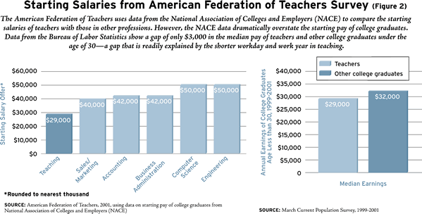
The most reliable data on pay and benefits for nonteachers are collected by the Bureau of Labor Statistics. Its economists and statisticians have a well-deserved reputation for maintaining very high standards for accurate and objective data collection on wages, benefits, labor force, and other economic data. Yet the AFT also presents tables and charts on earnings for new college graduates that rely on data collected by a private organization, the National Association of Colleges and Employers (NACE). Several times a year, NACE solicits reports on salary offers (not earnings) to graduating students. The AFT compares data from these NACE reports with scheduled starting salaries for teachers. In releasing the 2002 report, the AFT made much of the fact that “for new teachers, the $28,986 average beginning salary lagged far behind starting salary offers in other fields for new college graduates.” By comparison, the AFT says, accounting graduates were offered an average starting salary of $40,779; sales/marketing majors, $40,033; computer-science majors, $49,749; and engineers, $50,033 (see Figure 2).
While these NACE data apparently have some value to placement officers on college campuses (who pay the hefty subscription fee), they almost certainly overestimate the earnings of nonteachers. First, these data represent salary offers to a very small sample of the total number of college graduates. The 2001-02 report, for example, was based on only 2,600 offers to students in fewer than 120 higher-education institutions. More important, this sample of offers is likely to result in a misleading estimate of the earnings of all college graduates, since only large businesses or employers are likely to send recruiting teams to campus. Most small colleges do not submit reports to NACE. At a large state flagship institution such as mine, the University of Missouri-Columbia, only the business and engineering schools report job offers to NACE. Moreover, for the Missouri business school, the number of graduates far exceeds the number of job offers reported by the placement office.
The AFT’s data on starting pay for teachers must also be treated with some caution. Not all states collect such data, in which case the AFT estimates teachers’ starting pay. In the most recent report, the AFT had to estimate the starting salary in 17 states. However, researchers have no way of judging the accuracy of the AFT’s estimates, because they failed to document their methods.
A much more accurate picture of the relative pay of recent college graduates can be gleaned from Bureau of Labor Statistics national survey data on annual earnings. I pooled three years (1999 through 2001) of March Current Population Survey data and computed full-time annual earnings for college graduates under 30 years of age whose highest degree is a bachelor’s or master’s degree. I made no adjustments for hours or weeks of work. Not surprisingly, nonteachers earn more than teachers (see Figure 2): on average, 32 percent more (nonteachers earned $36,996, versus $28,156 for teachers). However, the pool of nonteachers has many more very high earners than the pool of teachers, which pulls the average up. Thus a more representative indicator of the typical teacher and nonteacher is median earnings. In this case, the gap in earnings between nonteachers and teachers falls to just 10 percent ($32,000 versus $29,000). The latter gap is readily explained by the shorter workday and work year for teachers.
Fringe Benefits
Neither the AFT nor the NEA makes any adjustments for the fringe benefits associated with teaching in a public school, thus masking an important part of total compensation. Unfortunately, published data do not permit precise comparisons of fringe (nonsalary) benefits for teachers and other professionals. For example, the Bureau of Labor Statistics reports fringe benefits for other professions, which include paid vacations. But nearly all teachers are on nine- or ten-month contracts and thus do not receive paid vacations. In addition, due to idiosyncrasies in the federal Social Security law, in some states teachers are included in state pension plans as well as Social Security, while in others they are not. Published Bureau of Labor Statistics data on benefits for “teachers” employed by state and local governments also combine full-time postsecondary teachers with K-12 teachers. This makes the comparison more difficult, but since public K-12 teachers account for more than 80 percent of the combined total, the data still provide some insight into the comparative benefits of teachers.
Employers’ largest fringe benefit cost is retirement plans. Virtually all public school teachers are included in traditional defined-benefit plans in which teachers receive pension payments according to a defined schedule on retirement. These differ from defined-contribution plans, like the TIAA-CREF plans in most public and private colleges, in which the retirement benefits depend on investment earnings and saving rates and may vary from employee to employee. Public school teachers become eligible for pension benefits (or “vest”) in these plans after five to seven years of employment. The contributions to these systems made by school districts or states are substantial. And because of the high turnover rates of teachers in their early years, these defined benefit plans in practice transfer wealth from young to more senior teachers.
The result is a system that permits teachers to retire earlier than they would if they were covered by Social Security or a conventional pension plan. For example, in the Missouri teacher pension system, a teacher who began teaching at age 22 and served continuously could retire at age 55 with 84 percent of her annual salary. In addition, her pension payments would be adjusted for inflation on an annual basis. Regular cost-of-living adjustments are unusual in private-sector defined-benefit programs. This teacher could also take employment in a new job and still collect her full pension benefits as long as the new employer was not a Missouri public school district.
National data show a similar pattern. In the 1994-95 Schools and Staffing Surveys, both male and female teachers who retired by the next school year averaged 59 years of age at retirement. By comparison, new retirees collecting Social Security retirement benefits have average retirement ages of 63.7 (men) and 63.6 (women).
The second largest fringe benefit cost (as a percentage of payroll) is health insurance. Health insurance coverage for public school teachers is nearly universal (more than 99 percent). The Bureau of Labor Statistics reports that health insurance benefits amount to 7.1 percent of hourly compensation costs for teachers (including postsecondary), but only 5.1 percent for professionals in private business. These same data suggest that the benefits provided to teachers are attractive relative to the private sector. For example, for individual policies, only 20 percent of health insurance plans for professional or managerial employees in medium and large private-sector firms are fully paid by the employer. The comparable share for teachers is 51 percent. Only 10 percent of medium and large private firms pay the full premium for family policies, compared with 29 percent in public school systems.
 Private-Sector Teachers
Understandably enough, in comparing the salaries of public school teachers with those of other professionals, the AFT does not make what may be the most relevant comparison: between public and private school teachers. Perhaps this is why the levels of pay in private schools play such a small role in discussions of compensation in public schools. In areas other than K-12 education, personnel managers routinely use pay and benefits in the private sector as a benchmark in setting government rates. This holds for professional jobs such as lawyers, accountants, and nurses. Indeed, one important function of the compensation data collected by the Bureau of Labor Statistics is to provide private-sector as well as state and local benchmark data for federal wage setting. Public higher-education administrators are well aware of the level and structure of compensation for faculty in private institutions.
But public school districts rarely consult private school data in making their compensation decisions, even though 12 percent of teachers are employed in private schools and the two sectors compete for teachers. Mobility between the two sectors is extensive: 36 percent of full-time private and 13 percent of full-time public school teachers report some teaching experience in the other sector.
There are, however, some legitimate objections to public-private comparisons. First, many private schools have a religious orientation and are staffed by teachers of the same religious denomination. To the extent that such schools are advancing a religious mission, their teachers may be willing to work for less out of a religious commitment. Second, private schools are generally more selective in admissions than public schools, and, on average, their students are from households with higher socioeconomic status. To the extent that this results in better-behaved and more academically motivated students, it makes for a more attractive teaching environment in private schools.
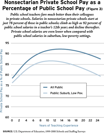
Figure 3 compares public and private teacher salaries in a manner that attempts to address these concerns. First, I included earnings data only for teachers in nonsectarian private schools. In addition, I excluded private schools that have a special emphasis (special education, Montessori, Waldorf) and focused on schools that most closely resemble traditional public schools in mission. I also controlled for teachers’ experience, gender, education level, region, and urban or rural status. As the graph shows, teacher pay in these private schools is consistently below that of public school teachers. Starting pay in private schools begins at 78 percent that of public schools, rises to 92 percent of public school pay by a teacher’s 12th year, and declines thereafter.
Even with the above adjustments, a critic might argue that private school teaching is not comparable with public school teaching since the socioeconomic status of private school students is higher. In order to make the public schools more comparable with private, I excluded more than 90 percent of the sample of public school teachers and retained only public school teachers in suburban schools with little poverty (fewer than 5 percent eligible for free and reduced-price lunch). With these new criteria in place, the results look quite different. Interestingly, the shape of the pay function remains the same, but simply shifts down. Private school teachers now start at salaries that are 76 percent of their public school counterparts. This increases to 87 percent by their 12th year and declines thereafter. These results suggest that compared with the private sector, public schools overreward high levels of experience. Why do they do this? In a recent study, Dale Ballou and I found that public school districts that are unionized and have a large share of high-seniority teachers are more likely to “backload” salary increases by adding additional steps to salary schedules or raising the rewards for seniority.
Benefits are lower in private schools as well. The median nonsectarian private school reports fringe costs (including Social Security) as 18 percent of payroll, while the comparable figure for public schools is 21.5 percent.
Salary Trends
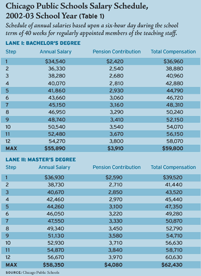
Computing the change in mean teacher salaries from year to year can paint a misleading picture of the average teacher’s situation. The reason is that public school salaries are set by schedules laid out in the teachers’ contract. These pay schedules, which apply to all the teachers in a school district, base salaries on a teacher’s years of experience and number of hours of graduate credits or graduate degrees. (See Table 1 for a typical salary schedule, from the Chicago Public Schools.)
When school districts raise the pay of teachers, they typically increase all the cells of these schedules by a fixed percentage, say 2 percent. Thus, if the education and experience of the average teacher in the district did not change from one year to the next, then average teacher pay would increase by 2 percent as well. However, that does not mean a typical teacher experienced a 2 percent pay increase between the two years. In fact, most teachers (except those who have “topped out” on the schedule) will receive a pay increase that is larger than 2 percent.
For example, a new teacher with a bachelor’s degree hired in Chicago in the fall of 1999 earned $32,561. Between the fall of 1999 and the fall of 2002, the average starting pay for Chicago teachers rose a modest 6.1 percent. However, by the fall of 2002, that teacher hired in 1999 is now in her fourth year of teaching and her pay will have increased to $40, 071, or 23.1 percent in three years. If the 2003-04 salary schedule again rises by 2 percent, as it has over the past several years, then at the start of the 2003 school year her salary will have grown by 31.1 percent. If she earns a master’s by that time, as many teachers do, her pay will have increased by 38.6 percent in four years—an average annual growth rate of 8.5 percent.
Given the steep tilt of salary schedules, changes in the experience mix of the workforce can be an important factor affecting changes in average teacher pay from one year to the next. This experience-composition problem also arises in analyzing national trends in average teacher pay, since many school districts are hiring more inexperienced teachers in response to rising enrollments, falling class sizes, and the retirement of older, more highly compensated teachers. According to U.S. Department of Education data, the median number of years of full-time teaching experience for public school teachers fell from 14 during the 1994-95 school year to 12 in 1999-00. Such a decline in the seniority mix of teachers tends to artificially mask the growth of average teacher pay and to bias comparisons of growth in teacher pay with pay in other professions, where the workforce is typically aging. It also makes simple cross-section comparisons of average pay between school districts or states problematic. We cannot be sure whether average pay is 10 percent higher in state A than in state B because salary schedules are higher in A or the teachers are older.
Trends in teachers’ salaries will also understate trends in teachers’ compensation if the costs of fringe benefits are increasing faster than salaries. Health insurance is an obvious example. Bureau of Labor Statistics data show that insurance costs (primarily health) represent 5 percent of hourly compensation costs for private-sector professional specialty occupations and managers, whereas for teachers they represent 7 percent of compensation costs.
Between 1980 and 1998 private-sector wage and salary costs grew by 104 percent, whereas costs for health insurance grew by 337 percent (even after widely publicized efforts by private-sector employers to restrain costs by introducing copayments and joining HMOs). Unfortunately there are no comparable data on the rise in insurance costs for public school districts. However, even assuming that public school districts made equally strenuous efforts at cost containment and held their health insurance cost increases to 337 percent, to the extent that health insurance is a larger share of payroll costs for public schools than for other private-sector workers, the relative compensation of teachers has increased. In short, in comparing the earnings of teachers and nonteachers, one cannot examine only trends in salary and assume that fringe benefits have been constant.
As states and districts attempt to meet the “highly qualified” teacher requirements of the No Child Left Behind Act, it will become increasingly important to gather more complete and accurate data on the relative pay and benefits of teachers. These data should also be disaggregated to reflect the fact that teacher labor markets are local or regional, and not national in scope. Attention should also be paid to differences in the opportunities that teachers face in the world outside teaching: a high-school physics teacher’s potential earnings are not the same as an elementary-school teacher’s. Policy discussions in this area have relied almost exclusively on the salary data collected by the teacher unions. A valuable step forward would be for the National Center for Education Statistics, in collaboration with the Bureau of Labor Statistics, to expand data collection on the relative pay and benefits of public school teachers so that states and school districts can have objective, arms-length data on this important issue.
–Michael Podgursky is chairman of the department of economics at the University of Missouri-Columbia.