
It’s one of the great conundrums of American public education: Even when calculated in constant dollars, and even after the Great Recession, the U.S. is spending dramatically more per pupil than in decades past, yet teacher salaries have barely kept pace with inflation. This raises several key questions: Where is the money going, if not into salaries? And how much could we pay teachers if we prioritized higher salaries instead?
To be clear, I don’t have all the answers. But I do have a fresh look at the data.
Introducing the salary-to-spending ratio
To shed some light on this issue, I decided to compare average teacher salaries to average per-pupil spending—by state, and over time, all in inflation-adjusted dollars.
This is a twist on just looking at average teacher salaries, which can be instructive if you want to understand where teachers have the best argument that they are underpaid (especially if the numbers are adjusted for cost of living differences). That’s important information, especially in this season of teacher strikes and protests, but I was curious about a different question: Which states, if any, have prioritized higher teacher pay over other possible uses for their education funds? To put it another way, as spending rose in recent decades, which states have chosen to put the additional dollars into higher salaries instead of other options, such as smaller classes, employee healthcare and retiree benefits, or additional staff, especially?
That’s because, as my colleague Checker Finn has long argued, if we as a country had chosen better teachers (via higher salaries) over more teachers (via smaller class sizes and more personnel), we might have gotten stronger results.
Keep in mind that changes in average teacher salaries can reflect both changes in teacher pay scales and in teacher “composition.” For example, if the teaching force becomes significantly younger over time, average teacher salaries will drop, even if the pay scale stays the same.
So let’s look at the data, first for the United States as a whole. Again, to keep things simple, we’ll compare the average teacher salary for a given school year to average per-pupil spending, and call it the “salary to spending ratio.” Here’s what that’s looked like from 1990 forward:
Table 1: U.S. average teacher salaries, average per-pupil expenditures, and salary to spending ratio, 1990–2016 (inflation-adjusted)
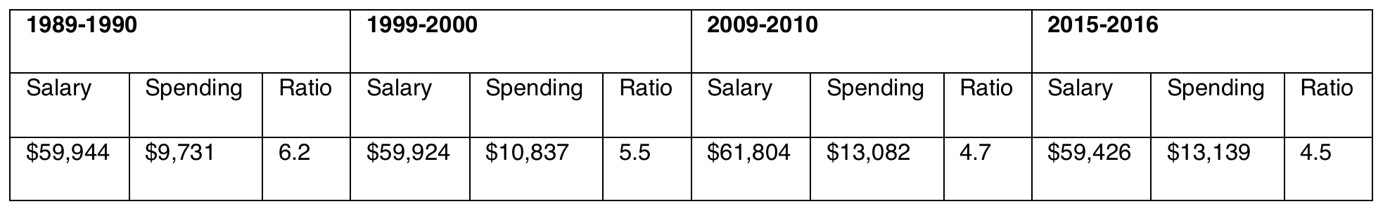
Source: National Center for Education Statistics, Digest of Education Statistics 2019, tables 211.60 and 236.70.
The average teacher salary has been remarkably consistent over this period, even though spending has increased by 35 percent, and that has dropped the salary-to-spending ratio from 6.2 in 1990 to 4.5 in 2016. If salaries had risen at the same rate as spending, the average teacher salary by 2016 would have been more than $80,000 per year, versus a bit less than $60,000.
Salary-to-spending ratios: State-by-state differences
So the U.S. as a whole now has a salary-to-spending ratio of 4.5. Are there any differences at the state level? That might suggest that some states are making higher teacher salaries a priority. There are indeed differences. Here’s how it looks for 2015–2016.
Table 2: Average teacher salaries, average per-pupil expenditures, and salary to spending ratios, 2015–16
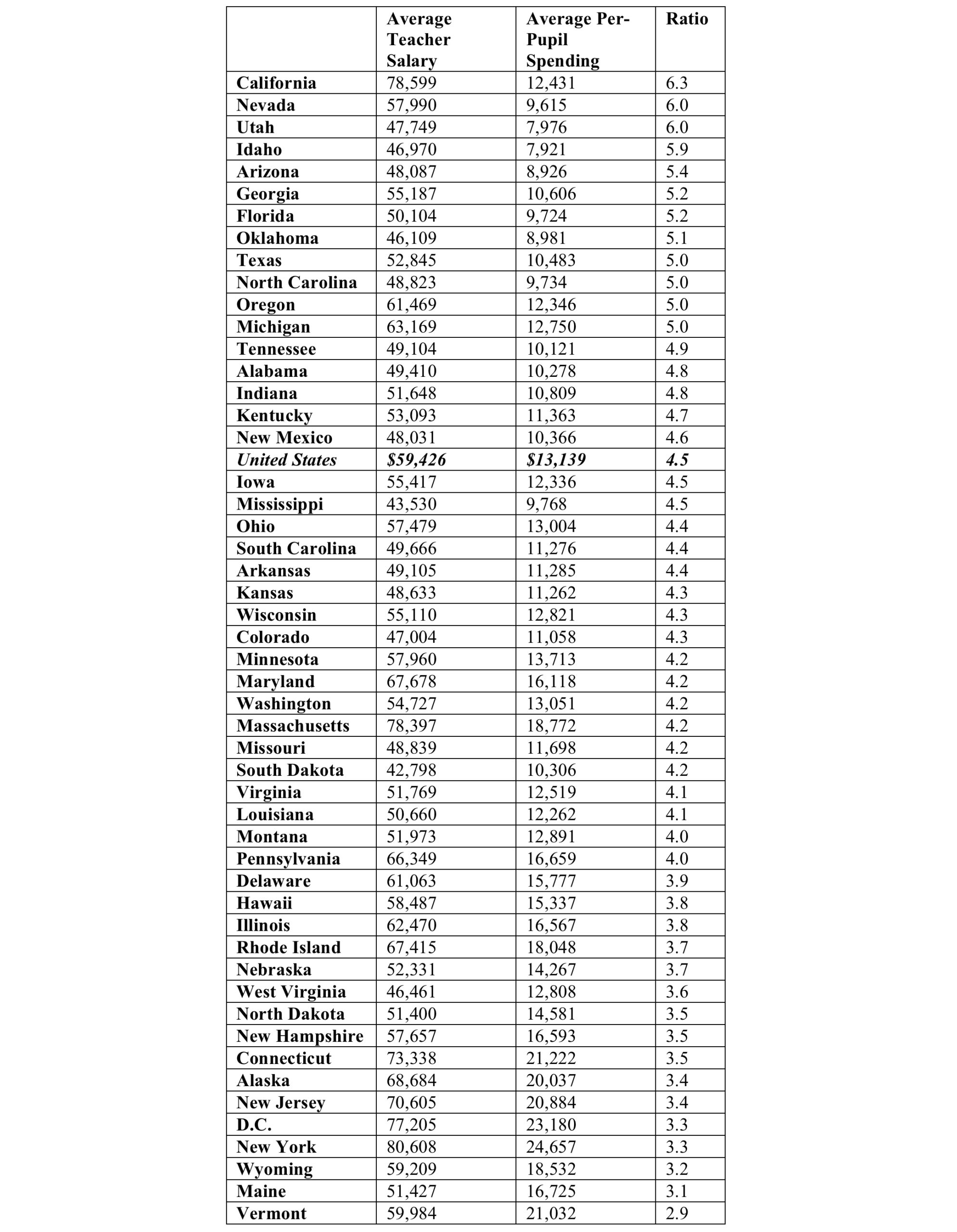
It’s hard to know what exactly to make of these data, but a few patterns do jump out. First, many fast-growing, low-spending states, such as Idaho, Arizona, and Georgia, appear to put more of their scarce dollars into teacher salaries. California is not exactly a low-spending state, yet it’s at the top of the list too, presumably because its high cost of living means it needs to pay more to have any chance at recruiting quality teachers.
Many high-spending states, on the other hand, appear to allocate their additional dollars into more staff, or other items, rather than higher teacher salaries. Maybe that’s understandable in low-cost-of-living states, but it sure seems that expensive ones like New York, Rhode Island, and Connecticut should be putting even more of their dollars into higher salaries. If New York’s salary-to-spending ratio matched California’s, for example, it could be paying teachers an average of about $155,000 a year, instead of the actual average of about $80,000.
I also wonder about special education. Many of the states at or near the top of the list, including California, have famously low rates of special education identification, while many toward the bottom, such as New York, have high rates. Is that because some states truly have more kids with disabilities? Or are lower-spending states finding ways to be stingier about who gets identified, thus avoiding the need to hire lots of additional support staff?
State-by-state salary-to-spending ratios over time
Let’s take one more cut at the data, and see if any interesting patterns emerge at the state level over the past quarter century.
Table 3: Average teacher salaries, average per-pupil expenditures, and salary to spending ratios, by state, 1990–2016 (inflation-adjusted)
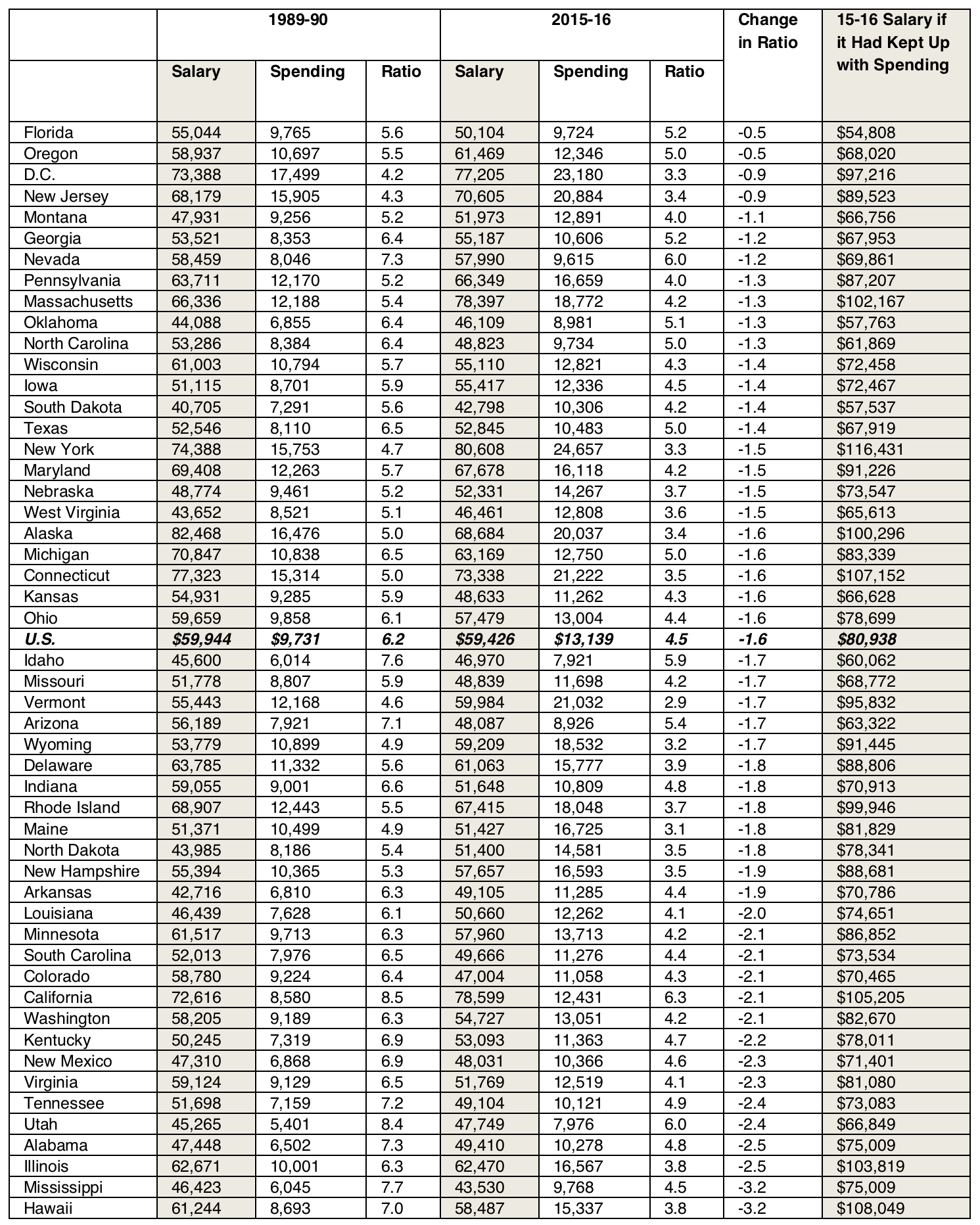
Now we have a different way at looking at the issue. It’s notable that the salary-to-spending index decreased in every single state, showing that salaries faced competition from other expenses everywhere. Throughout the economy, health care expenses have eaten into pay, so that’s one likely culprit.
But some states held the line on salaries much more than others.
Florida comes out on the top of this list, though it’s a peculiar case, given that inflation-adjusted salaries there actually declined over this period. But given how flat spending has been in the Sunshine State, it could have been worse had leaders not kept their scarce dollars from going elsewhere.
Better examples are Oregon, D.C., and New Jersey, all of which increased their spending over time, and found a way to drive at least some of the additional dollars into salaries.
At the bottom of the list are states that could have plowed their big spending increases into higher teacher salaries but didn’t. Illinois may be the poster child, with per-pupil expenditures rising from about $10,000 in 1990 to more than $16,500 by 2016. Yet teacher salaries barely budged. If they had instead kept pace with spending (which is what the last column shows), they would have risen from about $63,000 a year to over $100,000.
* * *
To be sure, this analysis is just scratching the surface. Additional analyses could go much deeper, looking at changes in school expenditures over time, and examining the impact of smaller class sizes; the hiring of additional staff, like teacher coaches; the rising costs of health insurance and pension payments; and other categories of spending, like administration. Breaking all of this out by state would be instructive, as it would help policymakers in a given jurisdiction understand the choices their own schools are making, and start to investigate why that might be.
In the meantime, when someone complains that teacher salaries are not high enough, you should agree with them. But next explain that the problem in most places isn’t overall education spending—it’s how we choose to invest our dollars. And you can really rock their world by saying that schools in Nevada, Utah, and Idaho are prioritizing teacher pay much more so than their counterparts in Vermont, Maine, and New York.
Mike Petrilli is president of the Thomas B. Fordham Institute, research fellow at Stanford University’s Hoover Institution, and executive editor of Education Next.
This post originally appeared in Flypaper.