For a couple weeks now, I’ve been obsessing over this map. It’s the product of a remarkable research project that collected and analyzed the incomes of the thirty-year olds who were born between 1980 and 1982.
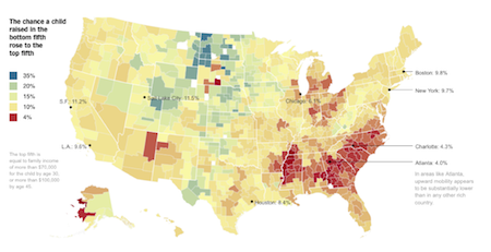
The map shows, by small geographic areas, the likelihood that a child born into the lowest-income quintile ended up (as an adult) in the highest-income quintile.
This isn’t the necessarily the best indicator of economic mobility, but it is still edifying. (The fantastic interactive map from the Times allows you to look at mobility from a number of other angles, as well).
A whole lot of staring at this map and some additional research has produced ten thoughts—most of them gloomy.
1. The miniscule chance of a rags-to-riches rise in some locations takes my breath away. In Memphis, the chance of this “lowest-to-highest” movement is only 2.6 percent. Atlanta, at 4 percent, is barely better.
2. The stickiness of poverty in some locations is heartrending. In most of the red areas in the Mississippi Delta, a child born into a family at the tenth percentile of earnings has a 75 percent chance of having an adulthood in one of the bottom two economic quintiles.
This is a catastrophic distortion of the American Dream.
3. The belt of red in the Southeast is absolutely shameful. An entire swath of our nation is constricting the opportunities of low-income kids. The “Rust Belt,” once the nation’s manufacturing hub, consisting of cities like Cleveland, Detroit, Indianapolis, Milwaukee, and St. Louis, is almost as sad.
4. I’m somewhat heartened by the greenish areas of significant “lowest-to-highest” mobility stretching vertically from North Dakota to Texas and radiating west into Montana, Wyoming, Utah, and Colorado and east into Minnesota and Iowa. I need to do more research to understand what’s happening (perhaps various industries or cultural practices are at play).
5. This second map, also from the Times, seems to partially explain variation in mobility rates. Areas with low overall poverty rates seem to provide a better chance of substantial upward mobility for the poorest kids. Areas with concentrated poverty appear to do the opposite.
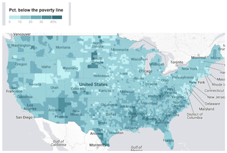
6. This poverty map, however, also reveals something disturbing. The red swath in the Deep South is not uniformly high poverty. For example, there are areas in Alabama, Georgia, South Carolina, and North Carolina that have relatively low poverty rates and yet have terrible mobility rates for the poorest kids. And there are areas in Appalachia (West Virginia and Kentucky) that have very high poverty rates and elevated mobility rates for low-income children.
So what’s going on? This next map painfully explains part of it.
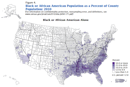
7. Dating back to the scourge of slavery, areas of the Deep South have had the nation’s highest percentage of African Americans. Due to the Great Migration, cities in the industrial Midwest have also had substantial African American populations.
The first and third maps viewed in combination should drop your jaw.
For the most part, the places in our nation with the highest percentages of African Americans offer the lowest-income kids the bleakest hopes of making it to the top.
8. While many of us have focused intently on low-income kids in urban areas, the first map forces us to come to grips with the limited opportunities afforded to low-income kids outside of inner cities. Much of the red swath in the South is rural (another reason I’m happy to be working on rural ed reform via ROCI).
9. Note the deep-red areas in South Dakota, Arizona, New Mexico, and Alaska. These are places with Indian reservations and/or large populations of Native Americans. Our country continues to do very wrong by these kids.
10. Let’s bring this back to K–12 schooling. Remember, the first map is based on kids born in the early 1980s, so it represents, in part, the schools of the 1980s and 1990s.
Although long-term NAEP data shows overall reading scores haven’t improved much over the last few decades, we have seen a narrowing of the achievement gap.
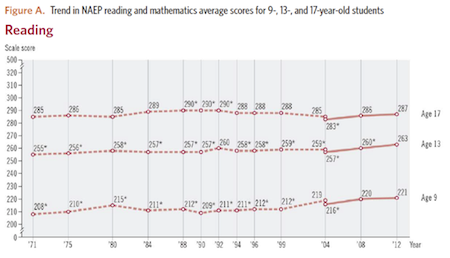
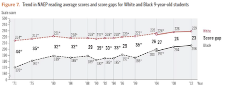
So maybe today’s schools will help produce more economic mobility. That’s reason for encouragement.
But there’s also reason to be seriously concerned. The graph below shows the 2013 reading scale scores for low-income kids by state. I’ve put in red the states with the lowest economic mobility rates for kids born in the early 1980s.
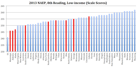
Tragically, low-income kids in Mississippi, Alabama, and Alaska perform worse than the low-income kids in every state, other than Washington, D.C. Though low-income kids in South Carolina, North Carolina, and Georgia are doing a bit better, this sadly suggests that the swath of red in the Deep South may be a stain that lingers unless those state’s leaders take dramatic action.
—Andy Smarick
This first appeared on the Fordham Institute’s Gadfly blog.


